In 2007, I was the production manager for American Stage Theater Company. The Artistic Director at that time, Todd Olson, included Gem of the Ocean in the season and it would be the first time I had worked on an August Wilson play. I had seen them, read them, studied them but never actually worked on them. I was also the Properties Designer for the play and found the challenges quite rewarding. The text was so full of imagery and poetic thought that I thought, “What a great play to design. Real and not real at the same time. A designer’s dream.”
Jeff Dean’s scenic design was everything you could want in a surreal design, and I was just in awe of how really beautiful it looked and how the play could support such a non-realistic design. Even though I didn’t design that production, I was hooked on the amazing storytelling of the plays and the simple yet complex way these characters saw the world. After the success of that production, American Stage committed to produce all of Wilson’s Century Cycle plays over a 10-year period. The entire staff was excited about this journey. I would go on to work on six of the ten productions, designing the sets for three (Ma Rainey’s Black Bottom, Jitney and now Joe Turner’s Come and Gone). As the company prepares to complete the cycle with Joe Turner in January 2017, I am very proud to be part of its beginning and its conclusion.
My initial approach to the design of Joe Turner has been my usual approach: come at it from two sides, the logical (what does it need?, what places are we in?) and the artistic (what do I want to say about this world?). Helping me through the journey, Director L. Peter Callender and Producing Artistic Director Stephanie Gularte gave me some things to think about. The play is based on a collage by Romare Bearden named “Mill Hand’s Lunch Bucket,” and we felt it was important that that be reflected in the design somehow. We want the play to not only be about this house, but about the world of the travelers in it with the outside and the inside worlds combining.
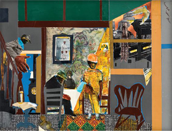
Bearden’s Mill Hand’s Lunch Bucket
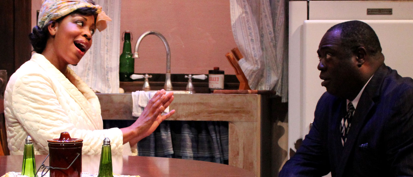
Now, American Stage’s space is different than most. The theater is a large rectangle with the audience seated in an “L” shape so the playing space is a rectangle in the corner. I have never thought of it as anything other than a challenge, which I enjoy – heck, I helped design it. The script calls for a kitchen, dining room, parlor, stairs going up to the bedrooms, a front door and an outside space for two scenes with the children. My logical thoughts were that the children’s space needed to be close to the audience (their voice aren’t going to be loud) and that the front door of the space (the door to the outside world) had to be center and prominent. Artistically, I thought about that Bearden collage and how all of the different people in the play were part of the collage of this story and how I wanted to replicate that with the design. The walls became different heights and different patterns and it was artistic and homey all at the same time. The next step was bringing the outside inside.
The key to the set, for me, is that front door. It is a portal for these characters into this magically realistic world, both inside and out, and I wanted to highlight that. I decided that I wanted the outside world to be replicated through art and made painted panels with my artistic response to Bearden’s work, based on without being literal, so much fun to play with. The outside world in this design is colorful, chaotic and kind of wonderful, if a bit overwhelming: how I imagine many of the characters seeing the world. The walls surrounding the front door became scrim so that this painted, chaotic world could be featured or subdued by lighting.
I have always loved the look of doors floating in space and that is what I would create for the center of this set. I made the inside SL and SR walls realistic (wallpaper, wainscoting, etc), but as the eye continues to the center front door, the pattern of the wall paper starts to enlarge and get darker until it finally disappears into the black scrim walls. So, realistic on the outside, but theatrical at the center (just like most of Wilson’s plays and especially this one!). When you look at the set, it first looks like a painting but then you notice the reality placed on top of it and it is a great contrast supporting that magical realism that is so prevalent in Wilson’s work. Of all of my designs for August Wilson plays, this is by far the most theatrical and expressionistic. I am very proud of it and the design journey I have taken with it, and can’t wait to see it onstage.

Cooper’s Set Design Rendering
I am no longer the Production Manager/Props Person at American Stage, but now serve as the Head of the Theater Department at St. Petersburg College. In addition, I teach Introduction to Theater Arts each semester and have taught the script for Joe Turner for many years. I have always loved the way the play goes from reality to “magical realism” and have enjoyed analyzing it with my students each time. So it made me very happy to be given the opportunity to design Joe Turner for American Stage, and to be able to share it with current and former students this January.
Wilson’s honest storytelling has been a great inspiration to me as a theatre artist, as well as an educator. I’m so thankful that his work continues to be part of my world; I am a happier and more well-rounded person for it.
For more articles in the Century Cycle Series, click here.

Noël Coward’s Travels
In celebration of the 125th anniversary of Noël Coward’s birth, here’s a look at the many places visited by the globetrotting playwright, interspersed with brief summaries of the classic stage works he created while traveling.

Kate Chopin in New Orleans: Mother-Daughter Author Duo Collaborate on Historical Book
Playwright Rosary Hartel O’Neill (author of Degas in Paris, The Awakening of Kate Chopin and other plays) and her daughter Rory O’Neill Schmitt discuss their latest collaboration, the nonfiction book Kate Chopin in New Orleans.

Heathers The Musical: 10 Facts for 10 Years
10 years have passed since Heathers The Musical’s explosive off-Broadway premiere! To celebrate anniversary, here are 10 facts about this hilarious, heartfelt and homicidal hit musical.